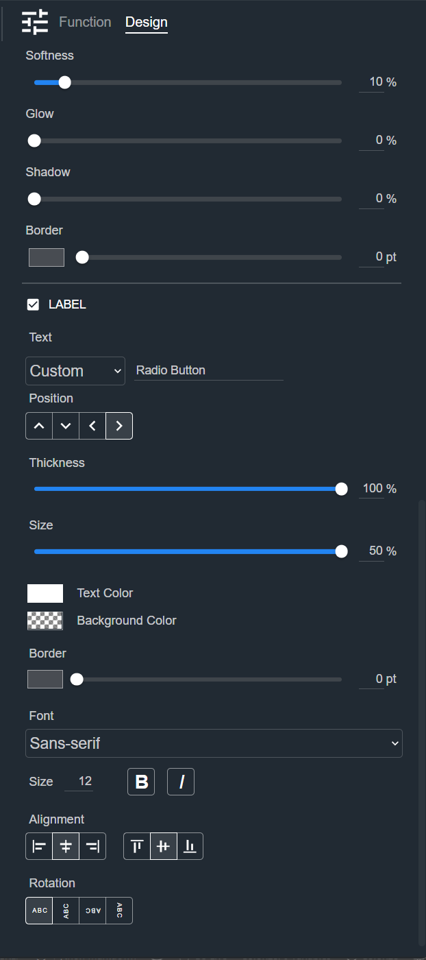
Radio Button
A Radio Button presents a set of options where only one can be selected at a time. The Design tab styles the selected Radio Button on a Control Panel. The sections appear top to bottom in the Modifier Panel.
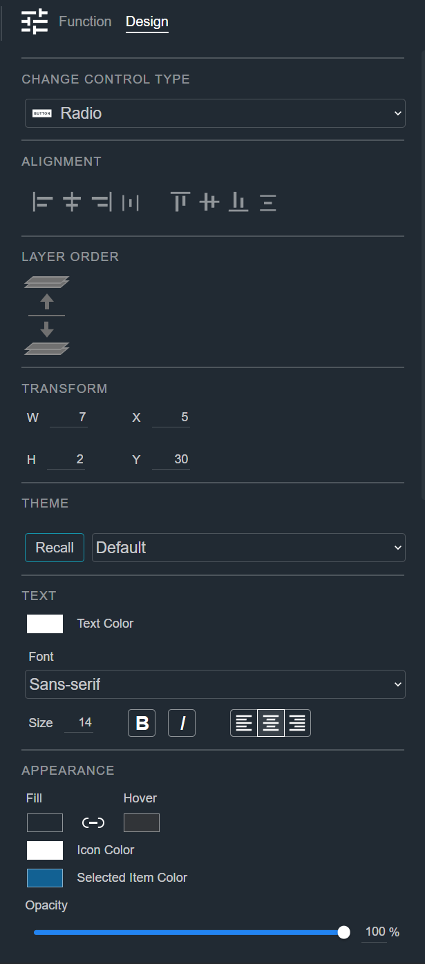
Change Control Type
See Common Controls.
Alignment
See Common Controls.
Layer Order
See Common Controls.
Transform
See Common Controls.
Theme
See Common Controls.
Text
See Common Controls.
Appearance
The Radio Button's Appearance section adds a Hover color, an Icon Color, and a Selected Item Color to the common appearance properties. See Common Controls.
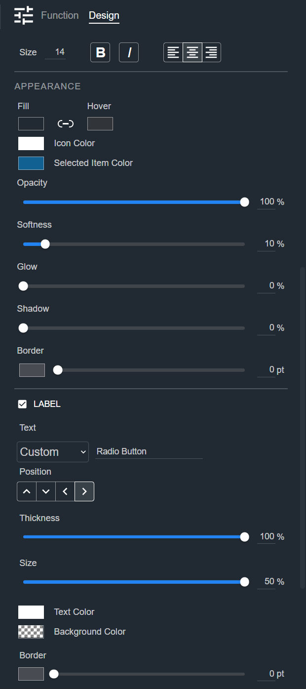
Label
See Common Controls.