Button
A Button is a control that performs an action or toggles a state when pressed. The Design tab styles the selected Button on a Control Panel. The sections appear top to bottom in the Modifier Panel.
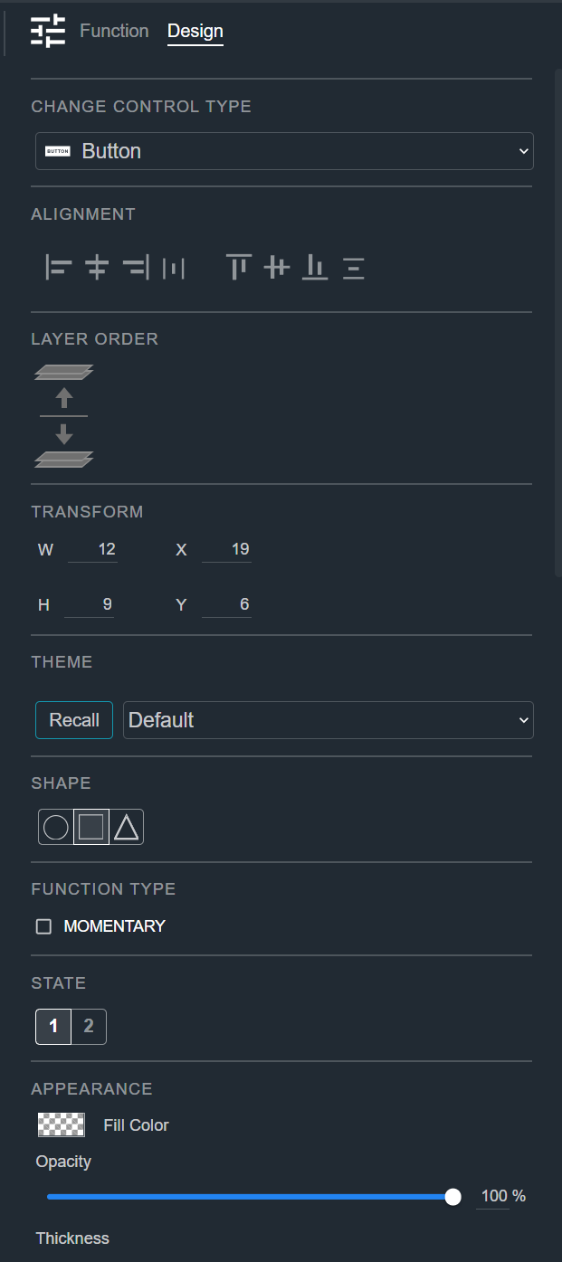
Change Control Type
See Common Controls.
Alignment
See Common Controls.
Layer Order
See Common Controls.
Transform
See Common Controls.
Theme
See Common Controls.
Shape
See Common Controls.
Function Type
Select the Momentary checkbox to make the button active only while it is held down. When cleared, the button toggles between its states with each press.
State
See Common Controls.
Appearance
See Common Controls.
Text and Icon
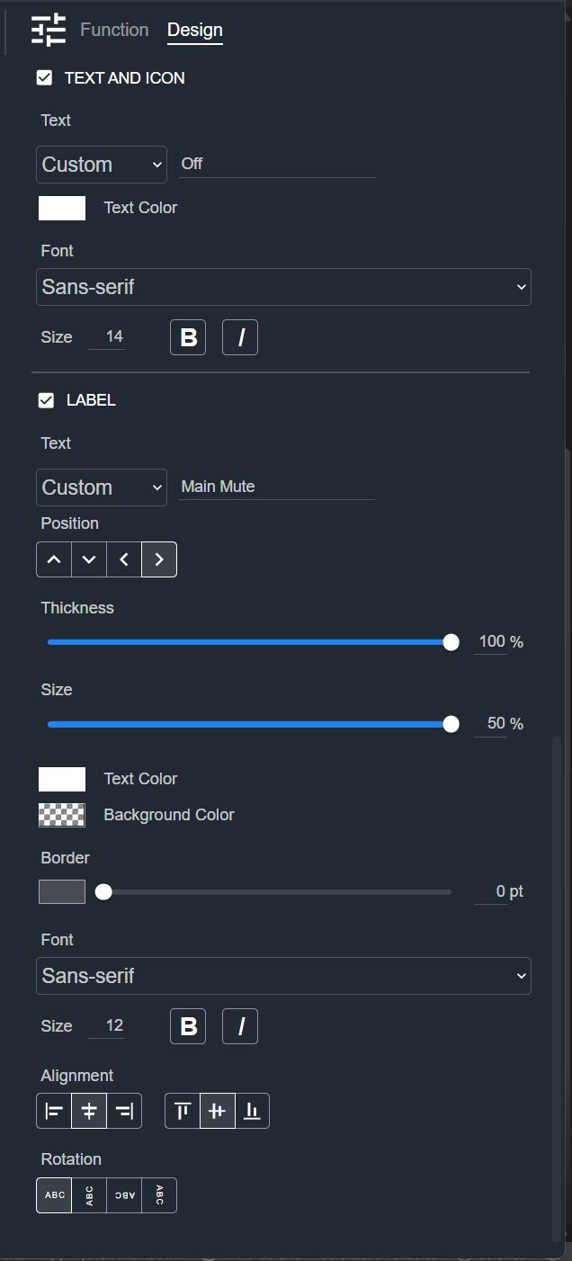
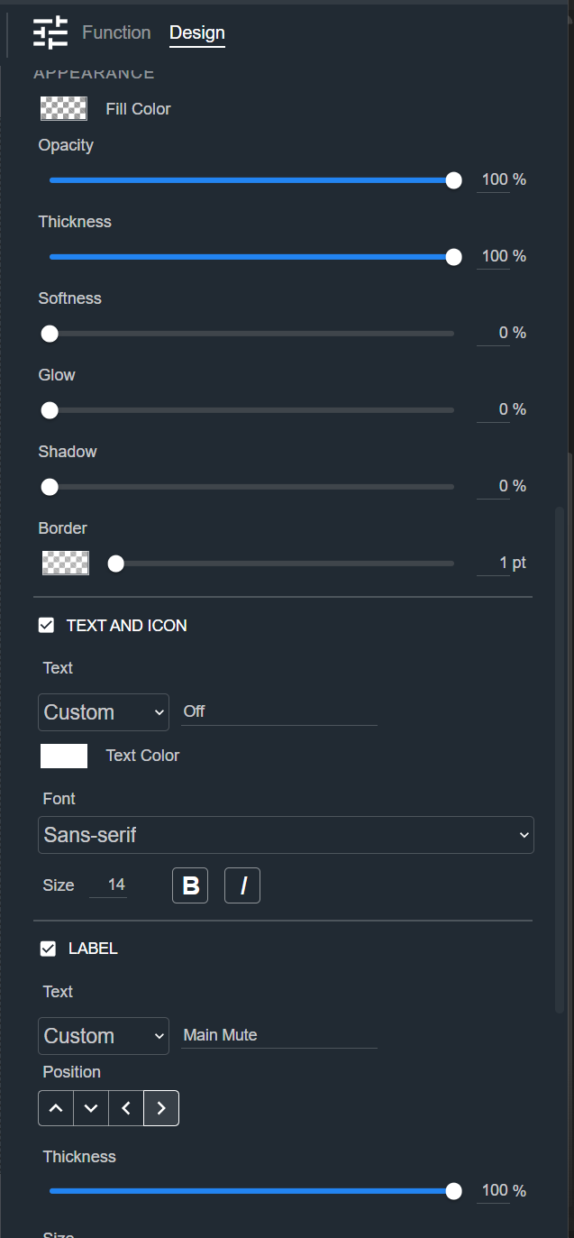
The Text and Icon section sets the text or icon shown on the button. Select the checkbox to show it.
- Text — Choose the text source from the dropdown (for example, Custom), then type the text in the field.
- Text Color — The color of the text.
- Font and Size — The font and font size, with bold and italic options.
Label
See Common Controls.