Basics and Icons
Basics and Icons are decorative elements you add to a Control Panel from the Toolkit. Use them for layout, visual structure, and labeling. They cannot be mapped to a signal-flow parameter.
- Basics — Rectangle, Circle, and Triangle. When you are editing the Control Panel Group of a Managed Device with a product or brand logo, Basics also includes Logo, which adds the logo as a Rectangle.
- Icons — Symbols such as power, volume, microphone, and media transport icons.
The Design tab styles the selected Basic or Icon. The sections appear top to bottom in the Modifier Panel.
Alignment
See Common Controls.
Layer Order
See Common Controls.
Transform
See Common Controls.
Shape
Shapes only. Choose a square, a circle, or a polygon. When you choose a polygon, set its number of sides and how far the sides are pulled in toward the center. See Common Controls.
Icon Type
Icons only. Choose the icon from the Icon type dropdown.
Appearance
See Common Controls.
Use a Shape as a Background
A shape makes a static background for your Control Panel, with the controls placed on top of it.
- From Basics in the Toolkit, drag the Rectangle onto the panel.
- Drag the shape to the size and position you want, or set them precisely with Alignment and Transform. To change the shape without deleting it and adding a new one, use Shape.
- In Layer Order, send the shape to the back, so it does not cover the controls you add on top of it.
-
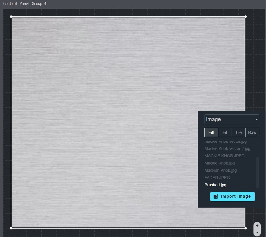
In Appearance, click Fill Color and choose a color or an image. See Choosing a Color.
A color other than white lets white text show up better. A light color still shows effects such as Glow.
Settings Basics and Icons Do Not Have
Basics and Icons have fewer settings than controls:
- The Design tab has no Change Control Type or Theme section.
- The Function tab shows only the Controls and Properties sections. Parameter Range and Mode are not shown.