Common Controls
The Design tab of the CPG Modifier Panel styles the selected control on a Control Panel. Many of its sections appear on more than one control type and work the same way wherever they appear. Those shared sections are described here, and the individual control pages link to them.
To open these settings, select a control on the Control Panel and click the Design tab in the Modifier Panel.
Editing Multiple Controls
You can select more than one control and edit them together. When you do, the Design tab shows only the sections and properties that every selected control has in common, and changing one of those properties applies it to all of the selected controls at once.
The shared sections narrow as the selection becomes more varied. Selecting every control on a Control Panel leaves only the sections that all control types share — Change Control Type, Alignment, Layer Order, Transform, Theme, and the common Appearance properties (Opacity, Softness, Glow, Shadow, and Border).
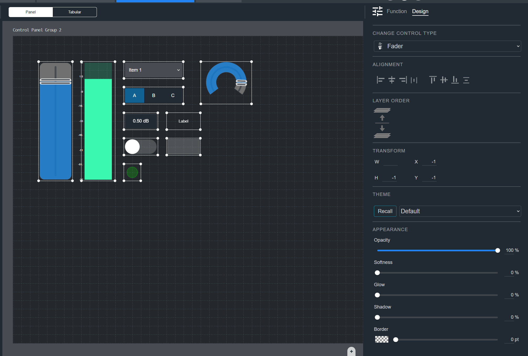
Change Control Type
Use the Change Control Type dropdown to switch the selected control to a different element type, such as a Fader, Button, or Meter. The control keeps its function mapping where it applies to the new type.
Alignment
The Alignment icons position the selected control within the Control Panel. The first group sets horizontal alignment (left, center, right, and distribute), and the second group sets vertical alignment (top, middle, bottom, and distribute).
When you select more than one control, alignment applies across the selection.
Layer Order
The Layer Order controls set how controls stack when they overlap. Move the selected control forward to bring it in front of others, or backward to send it behind them.
Transform
The Transform fields set the size and position of the control on the Control Panel grid.
- W — Width, in grid cells.
- H — Height, in grid cells.
- X — Column position on the grid.
- Y — Row position on the grid.
Theme
The Theme dropdown lists the available control themes (saved sets of colors and styling). Choose a theme and click Recall to apply its styling to the selected control.
Shape
The Shape section sets the outline of the control, on controls such as the Button and LED. Click an icon to choose a circle, square, or triangle.
Cap Style
The Cap Style section sets the appearance of the handle you drag (the cap), on controls such as the Fader and Knob.
- Click an icon to choose the cap shape.
- Use the Size slider to set how large the cap is.
State
The State selector chooses which state you are styling, on controls that have more than one state, such as the Button, Toggle, and LED. Select 1 or 2 to set the appearance of each state independently.
Appearance
The Appearance section sets the colors and visual effects of the control. The exact properties depend on the control type. Every control includes:
- Opacity — How opaque or transparent the control appears.
- Softness — How soft or feathered the edges are.
- Glow — The amount of glow around the control.
- Shadow — The amount of drop shadow behind the control.
- Border — The border color and thickness.
Most controls also include these color and thickness properties:
- Fill Color — The main color of the control. Text-only controls, such as the Label and Readout, do not have a Fill Color. On the Droplist and Radio Button this is labeled Fill.
- Background Color — The color behind the control. This appears on controls such as the Fader, Knob, Meter, Label, and Readout.
- Thickness — The thickness of the control's drawn element. The Droplist and Radio Button do not have a Thickness.
Some control types add their own appearance properties:
- A Fader or Knob adds Cap Color, Cap Detail Color, and a Track color and size for the handle and track.
- A Droplist or Radio Button adds a Hover color, an Icon Color, and a Selected Item Color.
Scale
The Scale section adds value markings along the control, such as on a Fader, Knob, or Meter. Select the checkbox to show the scale.
- Number — The number of divisions on the scale.
- Scale Color — The color of the tick marks.
- Text Color — The color of the scale numbers.
- Font — The font of the scale numbers, with bold and italic options.
- Position — Which side of the control the scale appears on.
- Size — The size of the scale text.
The icons at the top right of the section switch the scale between numbers and dots and toggle the tick marks on or off.
Unity
The Unity section adds a marker at the unity (0 dB) point on controls such as the Fader and Knob. Select the checkbox to show it.
- Text Color — The color of the unity text.
- Fill Color — The fill color of the unity marker.
- Border Color — The border color of the unity marker.
- Unity Tick Color — The color of the unity tick mark.
- Text — Switch the marker between a number and a text label.
- Position — Which side of the control the marker appears on.
Up Down Buttons
The Up Down Buttons section adds increment and decrement buttons to controls such as the Fader and Knob. Select the checkbox to show them.
- Icon Color — The color of the arrow icons.
- Button Color — The color of the buttons.
- Style — The visual style of the arrows.
- Shape — The button shape (circle or square).
- Size — How large the buttons are.
Label
The Label section adds a text label to the control. Select the checkbox to show the label.
- Text — Choose the label source from the dropdown (for example, Custom), then type the text in the field.
- Position — Where the label appears relative to the control.
- Thickness and Size — The thickness and size of the label.
- Text Color and Background Color — The label colors.
- Border — The label border thickness.
- Font and Size — The label font and font size, with bold and italic options.
- Alignment — The horizontal and vertical alignment of the text.
- Rotation — The rotation of the label text.
Readout
The Readout section shows the control's current value. Select the checkbox to show the readout.
- Position — Where the readout appears relative to the control.
- Thickness and Size — The thickness and size of the readout.
- Text Color and Background Color — The readout colors.
- Border — The readout border thickness.
- Font and Size — The readout font and font size, with bold and italic options.
- Alignment — The horizontal and vertical alignment of the text.
- Rotation — The rotation of the readout text.
Text
The Text section styles the text shown on text-based controls such as the Label, Readout, Droplist, and Radio Button.
- Text — Where available, choose the text source from the dropdown (for example, Custom), then type the text in the field. The Readout shows its mapped value, so it has no text source.
- Text Color — The color of the text.
- Font and Size — The font and font size, with bold and italic options.
- Alignment — The alignment of the text. The Label and Readout offer horizontal and vertical alignment; the Droplist and Radio Button offer horizontal alignment only.
- Rotation — The rotation of the text, on the Label and Readout. The Droplist and Radio Button do not have a Rotation.