CPG View Toolkit
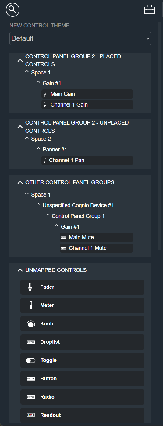
The Toolkit is the panel on the left side of Control Panel Group View. It lists everything you can add to a Control Panel — controls that are already mapped to your signal flow, generic unmapped controls, basic shapes, and icons. To add an item to your Control Panel, drag it from the Toolkit onto the workspace.
At the top of the workspace, use the search field to filter the lists by name. Next to the search field, a directional icon hides or shows the Toolkit. Each section can be collapsed or expanded by clicking its heading.
New Control Theme
At the top of the Toolkit is the New Control Theme dropdown, which shows Default until you choose another theme.
A control theme is a set of colors and styling that is applied to a control when you drag it onto the workspace. Click the dropdown to choose from the available themes. Cognio includes several pre-built themes, and you can create, save, and recall your own themes for use across multiple Control Panels.
Placed Controls
The Placed Controls section is labeled with the name of the current Control Panel Group, for example, Control Panel Group 2 - Placed Controls. It lists the mapped controls that have already been placed on the current Control Panel.
These controls are organized in a tree by Space and module, so you can see which signal-flow parameter each control is mapped to. Drag a control from this list onto the workspace to add another copy of it.
Unplaced Controls
The Unplaced Controls section is also labeled with the name of the current Control Panel Group, for example, Control Panel Group 2 - Unplaced Controls. It lists the mapped controls that have been added to the current Control Panel Group but have not yet been placed on the Control Panel.
Like the Placed Controls list, these controls are organized by Space and module and are already mapped to a signal-flow parameter. Drag a control from this list onto the workspace to place it.
Other Control Panel Groups
The Other Control Panel Groups section lists the mapped controls that belong to other Control Panel Groups in the Site. Use it to reuse controls that already exist elsewhere in your design.
The controls are organized in a tree by Space, device, and Control Panel Group. Drag a control from this list onto the workspace to add it to the current Control Panel.
Unmapped Controls
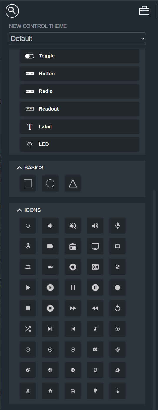
The Unmapped Controls section lists generic control elements that are not yet mapped to a signal-flow parameter. Drag one onto the workspace to add it, then map it to a function in the Modifier Panel.
The available unmapped controls are:
Basics
The Basics section contains simple shapes — a rectangle, a circle, and a triangle — that you can use for layout and visual structure on a Control Panel. Drag a shape onto the workspace to add it.
Basics are decorative and cannot be mapped to a signal-flow parameter.
Icons
The Icons section contains a grid of symbols you can add to a Control Panel for visual labeling, such as power, volume, microphone, and media transport icons. Drag an icon onto the workspace to add it.
Like Basics, icons are decorative and cannot be mapped to a signal-flow parameter.