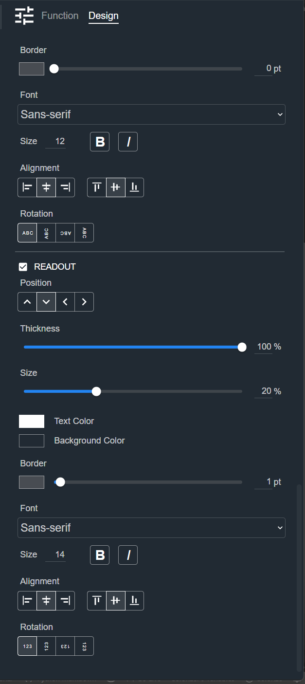
Meter
A Meter displays the level of a signal. The Design tab styles the selected Meter on a Control Panel. The sections appear top to bottom in the Modifier Panel.
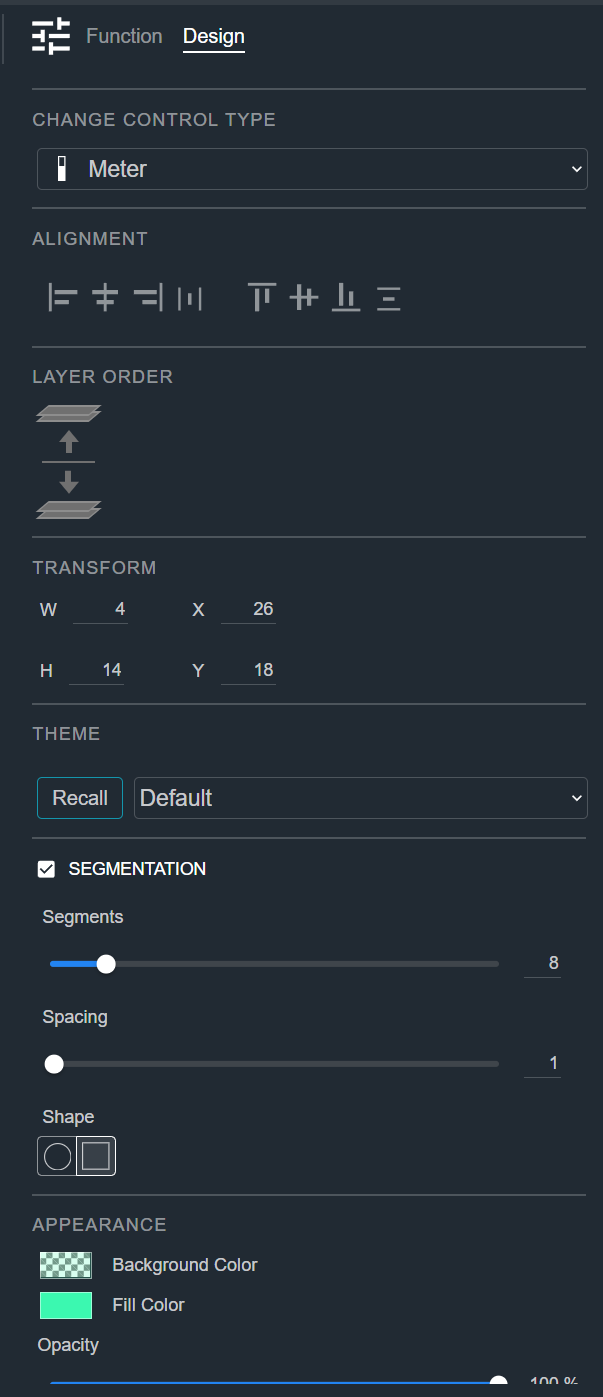
Change Control Type
See Common Controls.
Alignment
See Common Controls.
Layer Order
See Common Controls.
Transform
See Common Controls.
Theme
See Common Controls.
Segmentation
The Segmentation section breaks the meter bar into separate segments instead of a solid bar. Select the checkbox to turn it on.
- Segments — The number of segments in the bar.
- Spacing — The gap between segments.
- Shape — The segment shape (circle or square).
Appearance
See Common Controls.
Clipping
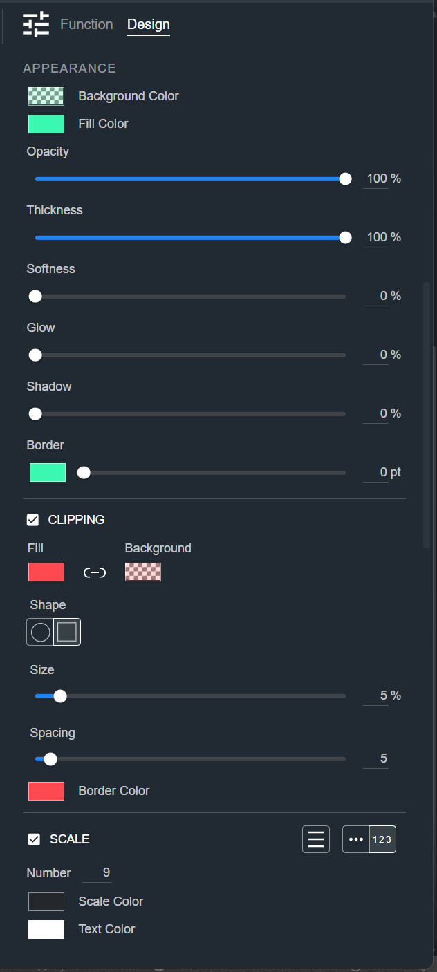
The Clipping section styles the clip indicator that appears when the signal peaks. Select the checkbox to show it.
- Fill and Background — The fill and background colors of the indicator. Use the link icon between them to set both at once.
- Shape — The indicator shape (circle or square).
- Size — How large the indicator is.
- Spacing — The gap between the indicator and the meter.
- Border Color — The border color of the indicator.
Scale
See Common Controls.
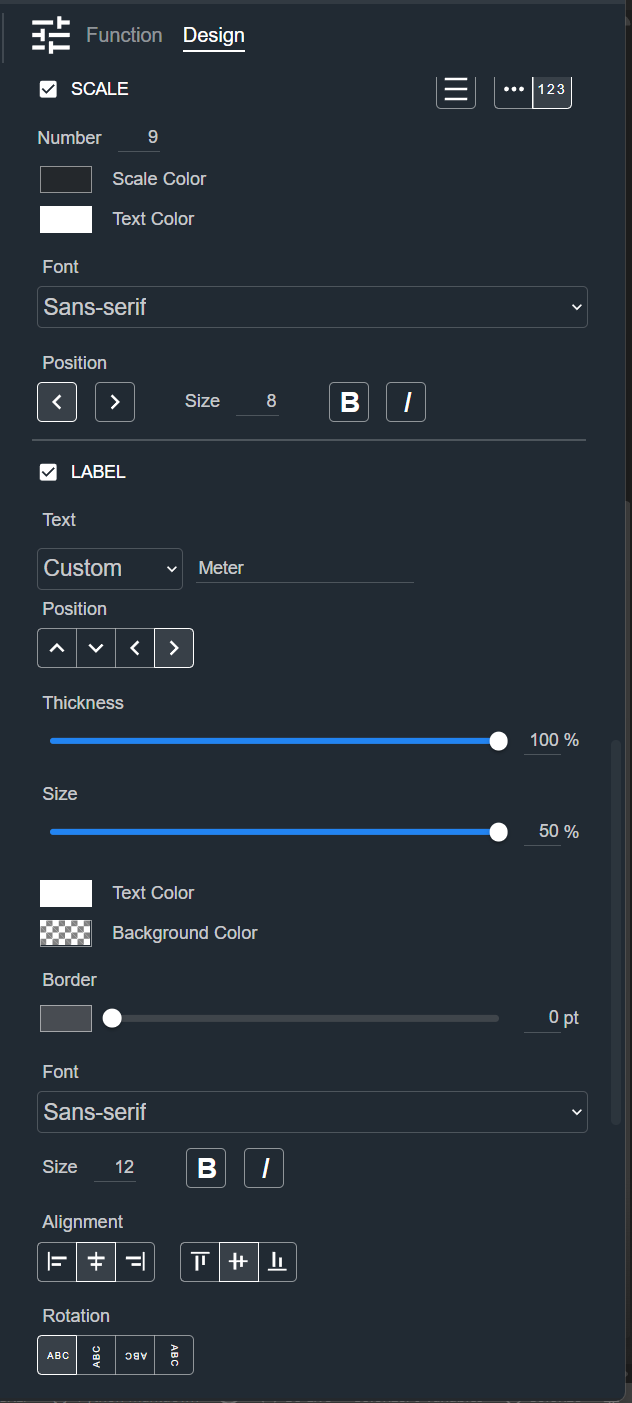
Label
See Common Controls.
Readout
See Common Controls.