Control Panel Group View
In each Space of the Site, you can create a Control Panel that lets the user adjust the settings of the available audio and video components. Display the Panels in each Space using Symetrix Touchscreens, or any suitable interface or display device.
The Control Panel Group Toolkit menus let you build a Control Panel from a wide variety of graphics such as faders, buttons, switches, displays, LEDs, text, and backgrounds.
Add a Control Panel Group
After creating Spaces in the Site View, click the + Add a Control Panel Group item in the Space block, or choose Import Control Panel Group from the menu on the left.
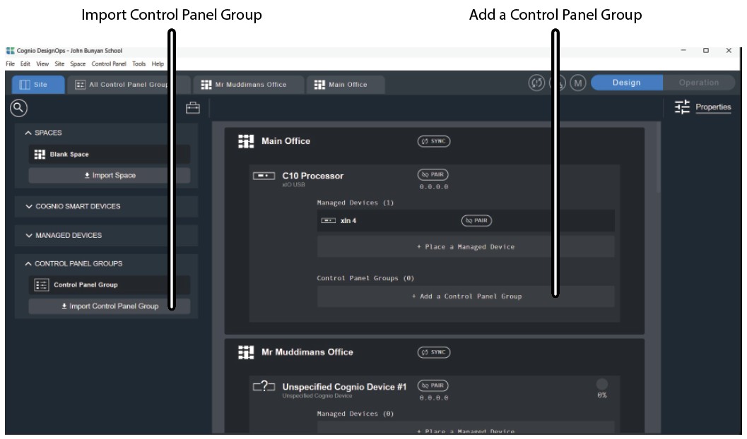
Import Control Panel Group brings up a search menu that lets you retrieve a previously created Control Panel Group.
When you add or create a Control Panel Group, a new blue tab appears at the top, labeled for example Control Panel Group 2 or Control Panel Group 3. Use these tabs to switch quickly between groups.
Control Panel Group Workspace
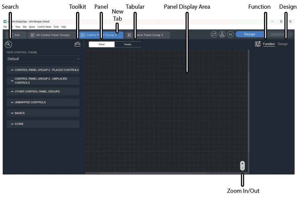
The Control Panel Group workspace canvas appears, with a new tab at the top.
Search Box
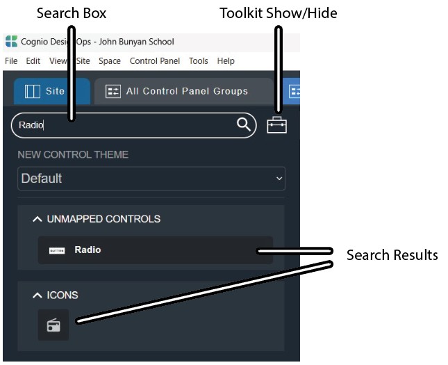
The Search Box at the left is a quick way to find existing Control Panel items. Type a search term, such as faders, circles, or buttons, and the matching items appear below.
Toolkit
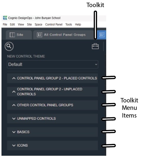
The Toolkit icon displays or hides the left column that shows the Toolkit menu. This is where you choose controls such as faders and buttons, shapes such as circles and squares, and common A/V icons, and add them to the display. Each menu item is described in more detail in CPG View Toolkit.
Panel
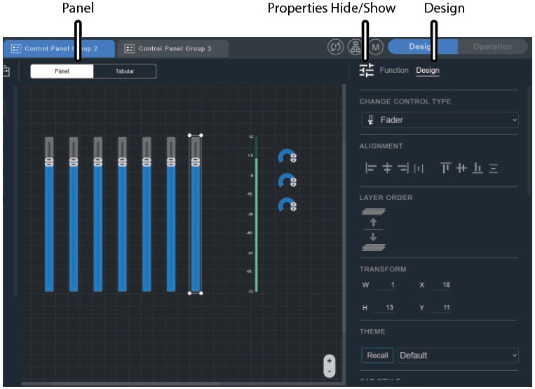
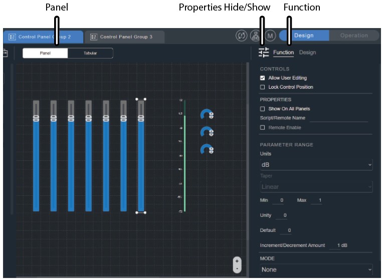
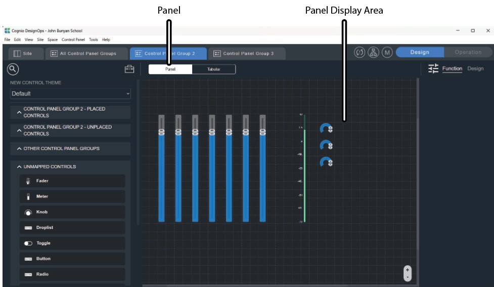
The Panel button brings up the graphical interface area where you build the panel. For example, the panel below shows seven faders, a meter, and three knobs, dragged from the Unmapped Controls menu at the left. Adjust these until the display looks the way you want. This view shows how the panel will look to the user.
Tabular
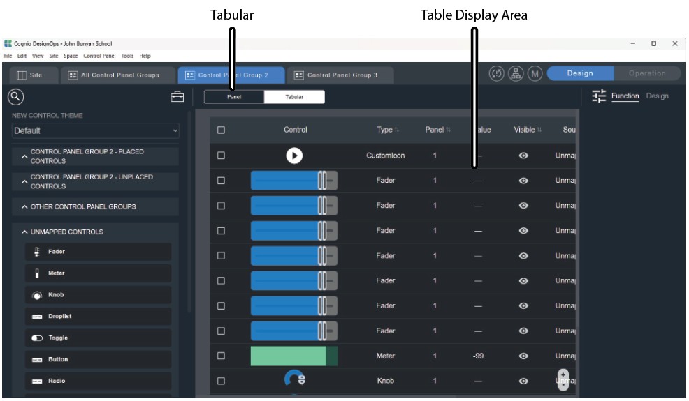
The Tabular button displays a list of each element currently used in the Control Panel.
Modifier Panel
At the far right of the toolbar, click the three bars to bring up the Modifier Panel, which shows Function and Design options for each control used in the Control Panel. Select a control first, and its details appear. In the example below, one fader is selected and its Design details are shown, where you can choose from the available options.